Part 1 - on website design
A good website design changes the brain
Our perceptions of everything are deeply connected with how we view them, from the looks and persona of the acquaintance we first meet, to the packaging on the loaf of bread we buy at the grocery store. Hopefully we don't have a bad habit of solely judging based on appearance. But, to a large extent, it is literally the case that appearance directly resembles what's on the inside. Here are a few examples of how this crazy connection plays out:
-
Pretty Packaging
 200 people were brought in a room to taste test 2 different brands of brandy. All the testers were blindfolded. The ratings came out equal. A second test was done: This time they showed the packaging. Brand B won hands down. Third test: Another 200 people came in, and this time they swapped the brandy into opposite bottles. This time brand A won hands down. The conclusion: the package design deeply affected people's perception of the taste. *
 -
The color of a soda can changes taste buds
There was an experiment done where 7up added 15% more yellow to green on their packaging, and people report tasting more lime then lemon flavor and claiming they had changed the taste, when all they changed was the color. * -
The flimsy business card
Quite a bit can be said about a company based on their business cards, the design and even the way the paper feels. If you have many business cards and flip through them, you'll find that business cards that look good, are printed well, and feel good are, for the most part, from larger and more well established companies. A flimsy business card often equals a flimsy business. A tacky design and crooked cut card probably resembles a disorganized and poorly established company. People who design or print notice these things when they first pick up and study someone's card. But most people pick up on these things wtihout even realizing it.

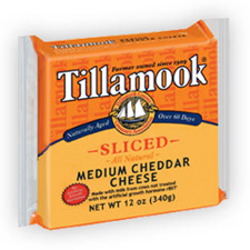
We usually don't even think about these things. We go to the grocery store and buy the bright yellow cheese with pretty packaging because we assume it's going to be fresh and tasty cheddar cheese. What we didn't know was that we probably would not have bought the cheese if they didn't put the yellow food coloring in it and do a ton of research designing their awesome cheese wrapper.
I buy Tillamook Cheese because (1) it looks like cheese, (2) their wrapper makes them look like a company who knows what they're doing (making good cheese), and (3) after I eat it I tell myself how good it tastes and go buy Tillamook cheese next time I go to the store.
The point in all this is to say that people subconsciously judge things based on appearance and make choices on a daily basis based on how they perceive things. We find a website and may stay solely based on the design. It may not be the case every time or with everyone, but is a huge contributing factor. It's usually the first thing we notice when we visit a website, something which often immediately attracts us or turns us aways.
* Both of these examples are from Blink.